
Now that you've seen the exterior of our newest home, let's take a look at the interior. These pictures were all taken on moving day. We tried to take them before the furniture stampede started. But a few eager pieces made it in already. Like I said in the previous post, the house is big, beautiful but a little dated. But a picture speaks a thousand words, so let's just dive in, shall we?
(PLEASE NOTE: Keep in mind that we could not afford this house normally! We are renting this place on the cheap while it stays on the market and we stage it. So please don't read this post as bragging or complaining. We're just staging & house-sitting for an extended period.)
Living Room

Dining Room

Kitchen

This is the view of the kitchen from the dining room doorway. Strengths: Love all the space! Floor space, cabinet space, counter space, butcher-block island space! Love it. Oh, and under those beautiful creamy-clay tiles: Radiant floor heating. Love. It. Design Challenge: as a house on the market, the back splash, matching drapes, and that mauve color peeking out above the cabinets could all be updated a bit.
Kitchen Nook/Open Area/TV Room

Strengths: Did I mention space? How about windows? This is our first "open concept" home (our 1920s and 40s homes didn't catch on to this trend yet). So we are falling in love with it. Design Challenge: Too much space? Could it be? We are scratching our heads at the amount of square footage between the nook and the TV Room area. Its a no-man's-land. Also, the curtained closet on the left puzzles a few... is it a closet? is it for a puppet show? No, its a component "Command Center"! One can put their sound system, etc in there, plug it in and it connects to speakers throughout the house. But to avoid the "stage entrance" feel, the curtains need to blend into the background a little more.

Here's another perspective of the Kitchen Nook/Open Area and part of the carpeted TV Room area. This is the perspective coming out of the front entryway, facing the back door.
Guest Bedroom

To the right of the entry way is the first of 4 bedrooms. Guest Room Strengths: Its just about perfect. Great paint colors (2 walls cream, 2 taupe), nice window overlooking the front porch, good sized room & closet. Design Challenge: The house's exterior walls are a smooth poured stucco, so hanging anything on the exterior wall is a little difficult. But we love the texture it provides.
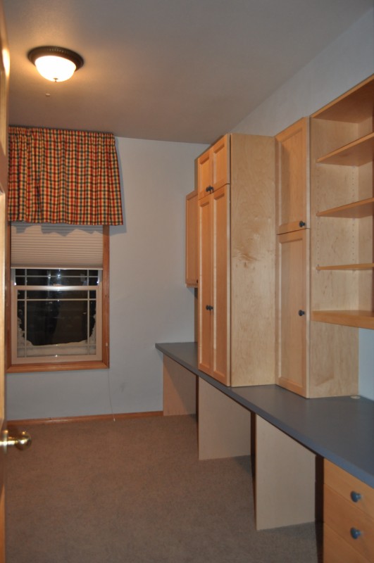
Study

Strengths: This room is also nearly perfect. It has a beautiful exposed-beam skylight above letting in some natural light. (Which is good since there are no windows.) Design Challenge: Because there are no windows (its potential "exterior" wall is behind the 3rd bay of the garage), it cannot be staged as a bedroom. So we are attempting to stage this large room as a Study, but our small desks shrink in the space. We're working on it. Stay tuned.
The Blue Bedroom
Strengths: As you can see from the picture, it has a whole wall of built in shelves and two desks. Perfect for our oldest girl A! And an extra desk for her younger sister Z to hang out in big sister's room. (or truth be told, an IDEAL scrapbooking station for ME while daughter A is at school!) Design Challenge: The walls are light blue (which I can work with) but curtain's rich colors will get changed out. Also, the counter top & cabinet hardware are blue, but workable.
The Red Bedroom


First, we're calling this the "Red Bedroom" for now because of the cute red ticking curtains. We like 'em, we'll keep 'em, we'll use some red accents to tie them into our youngest daughter Z's room decor. Strengths: All the usuals - good layout, window, closet, etc. It also has a nook the bunk bed fits into. Design Challenge: The shelves are in a place where you see the side of them when you enter the room, but we can work with those too.
Main Bathroom

Strengths: Double sink! The same wonderful heated floors, and good space. (Compared to our last mini-main (and only!) bathroom, this is the Taj Mahal! It has outlets! It has a fan! It has storage! We've come a long way since 1940.) Design Challenge: You can't tell, but this room has purple, blue & cream sponge-painted walls. Not exactly neutral for a staged house.
Master Bedroom


Strengths: Sorry, did I say Master Bedroom? I meant Master Suite! Its large.. with a large bathroom... with a large walk in closet. (Sigh!) I'm in Master Suite Heaven. Design Challenge: The walls are a shade of sage green - definitely workable, but the wallpaper boarder should be removed to update it & keep it neutral.
Master Bath

Strengths: Large tub, separate shower, heated floors. Its lovely large size. Design Challenges: Like the other bathroom, this also has sponge-painted walls - sage & cream. The drapes & hardware should be freshened up. But they do match the pink marble surfaces. Hmm... I'm thinking on this one.
Not Pictured...
The lovely Entry Way, a nice-sized Laundry/Mudroom that you enter in from the garage, an extremely wide & long Hallway that could be considered its own space, and a few more outdoor areas that we'll show at a later time. So, that's it! Our newest project that I am falling in love with. Stay tuned for some "After" and "During" shots in future posts!
The lovely Entry Way, a nice-sized Laundry/Mudroom that you enter in from the garage, an extremely wide & long Hallway that could be considered its own space, and a few more outdoor areas that we'll show at a later time. So, that's it! Our newest project that I am falling in love with. Stay tuned for some "After" and "During" shots in future posts!
No comments:
Post a Comment